As Joe Death and the Graven Image is completely written and drawn I’m now able to turn my attention to the cover(the one posted back in February of ‘21 is in need of an update), title pages, and chapter breaks. As its subtitle(Graven Image) suggests; sculpture, iconography, and symbolism have always been a part of this book. Though the story is continuous I want to have clear chapter breaks with titles of their own, places of rest that allow the reader to put it down or just think. In order for that to work, the breaks should take a slight departure from the normal style of the paneled pages. The biggest thing in effect is white space.
Mike Mignola, probably building on Jack Kirby’s mark-making and his own observations and reference, gave every cartoonist a sublime language for drawing sculpture, as is seen in virtually every pinup, cover, and illustration of his, examples below.
It seems even back in 1997(?) he was well known for this and Wizard magazine featured his tutorial on how to do it. Really good stuff here, open it in a new tab or drag and drop it to your desktop in order to read it.
If you read the tutorial text you noticed Mike suggests, at least several times, that you need to be looking at the real thing, tombstones in this case. That reality of background and setting, if achieved, will ground the fantasy adventure of fiction. It’s the George Lucas, “used universe” idea; if space and other planets exist in reality then ships would be unpolished, clothes would be worn, farm equipment, even moisture farm equipment, would be rusty and streaky.
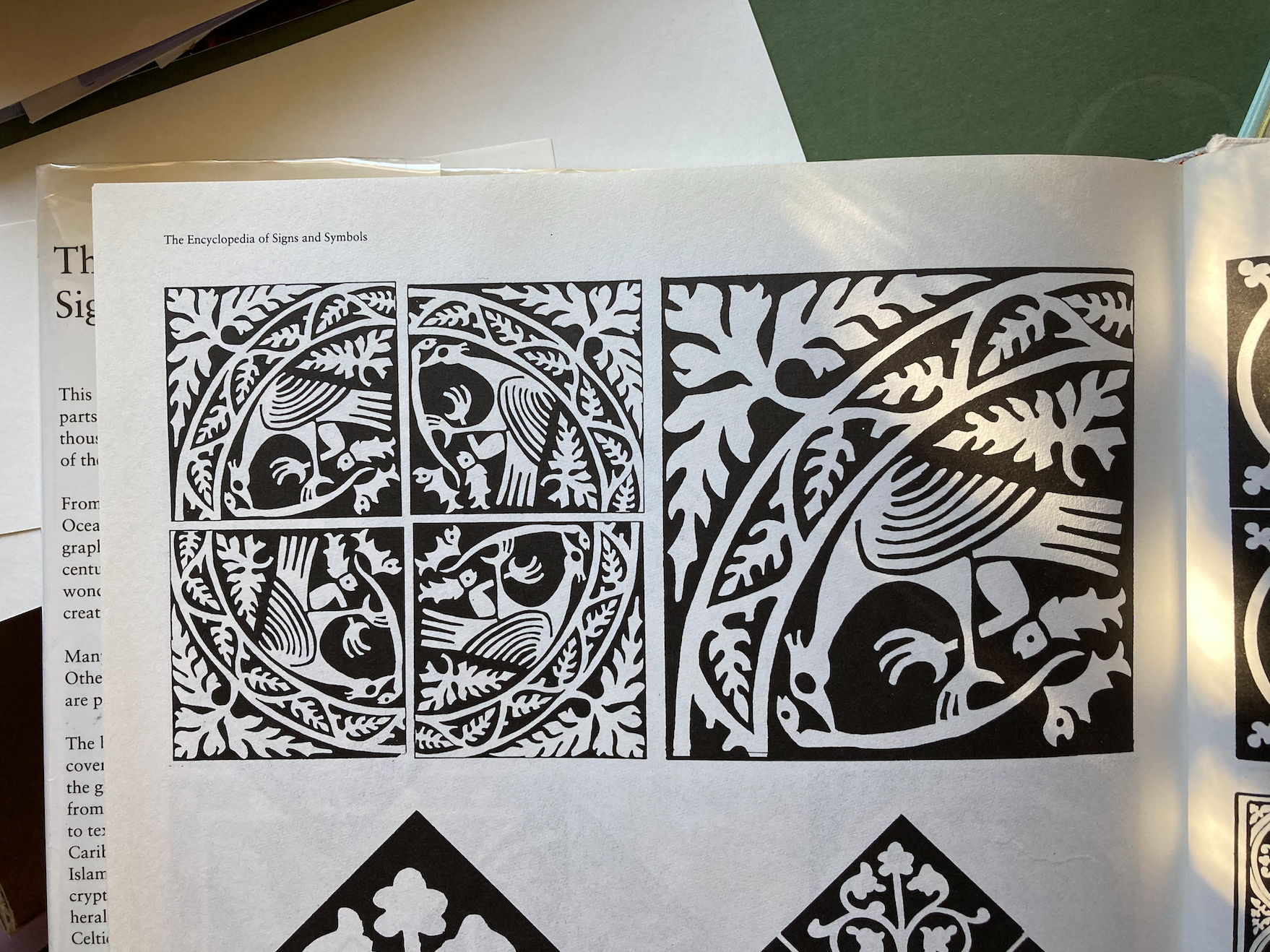
Well, I’m not creating Hellboy, or Star Wars, and chances are you aren’t either. So we need to bring our particular interests into this visual medium. I’m very interested in meaning, and how it manifests all around us in different ways. Joe Death is an exploration of that and so his world needs to be created from the ground up, similar to Tolkien’s. One of the tools extremely important to Tolkien were ruins, scraps of text from the ancient fictional past, poems long past down. The Lord of the Rings has the weight of meaning for many reasons, but one of them is this imagined past. Comics are a visual medium so what was a poem in Tolkien might translate better as a distressed sculpture, tombstone, tchotchke, totem. I went to this Encyclopedia of Signs and Symbols for a few good grabs to start learning the visual language of our past, the imperfections present in the imprecise mediums of stone, wood, clay, tapestry, etc.
At the risk of being pedantic, I’ll point out that what you see in my sketchbook(above) is design, not drawing. Design is the line that organizes and communicates information. I may have been drawing when doing this, but I wasn’t thinking about drawing. When you shoot an arrow from a bow at a target it’s best to look at the target and let your hands follow your line of sight. Thinking about drawing while drawing won’t allow you to design, you’ll be caught up in the trap of rendering. I thought only about animals and little rock sculptures when designing these elements, plenty of time for rendering after the design is made.
My first attempt on the far left here is wild, kind of a stream of consciousness sketch. I wanted to see the low resolution version and made this very fast. I liked it, but after some thinking, I decided to move away from Schoolhouse Rock and toward something a little more sophisticated and literary. So instead of the letters popping out I went back toward the reality of them being carved into stone, and kept close to the standard letter forms instead of trying to create my own wonky type.
These little animal totems started as ideas to be carved into the tombstone around the words. But, on its own, the tombstone looked pretty boring, so I tried surrounding it with smaller motifs. The result, I think, is a better presence on the page. I added a little benign poetry beneath before calling it quits. Joe Death and the Graven Image has six chapters, so the work of keeping the structure while making each one unique and interesting has begun! I’ll share more of this later, but definitely not all of them until the book is out there in print.
I hope you’ve found this helpful on your own artistic journey or at the very least, fun! If so, please consider sharing privately or publicly on any channel you may be a part of. If you’d like to be notified when I post future blog articles you can sign up for my weekly newsletter using the form below. Thanks!


