Professionally, my roots are in children’s books. They are shallow roots, but they’re still there and my affection for them has only grown as I work towards visual simplicity and atmospheric, or emotional, representation. Simplicity is often associated with graphic, clear visual information, icons, and infographics that get the viewer some quick learnin’. Atmospheric work on the other hand would be painting or illustration with a large range of similar and contrasting values, colors, and the illusion of a depth of field, foreground, middle, and background; you’re supposed to look for long periods of time at this kind and while there is information to be received it’s more of a restful mode, a conversation instead of dictation, an atmosphere to be in, not analyze.
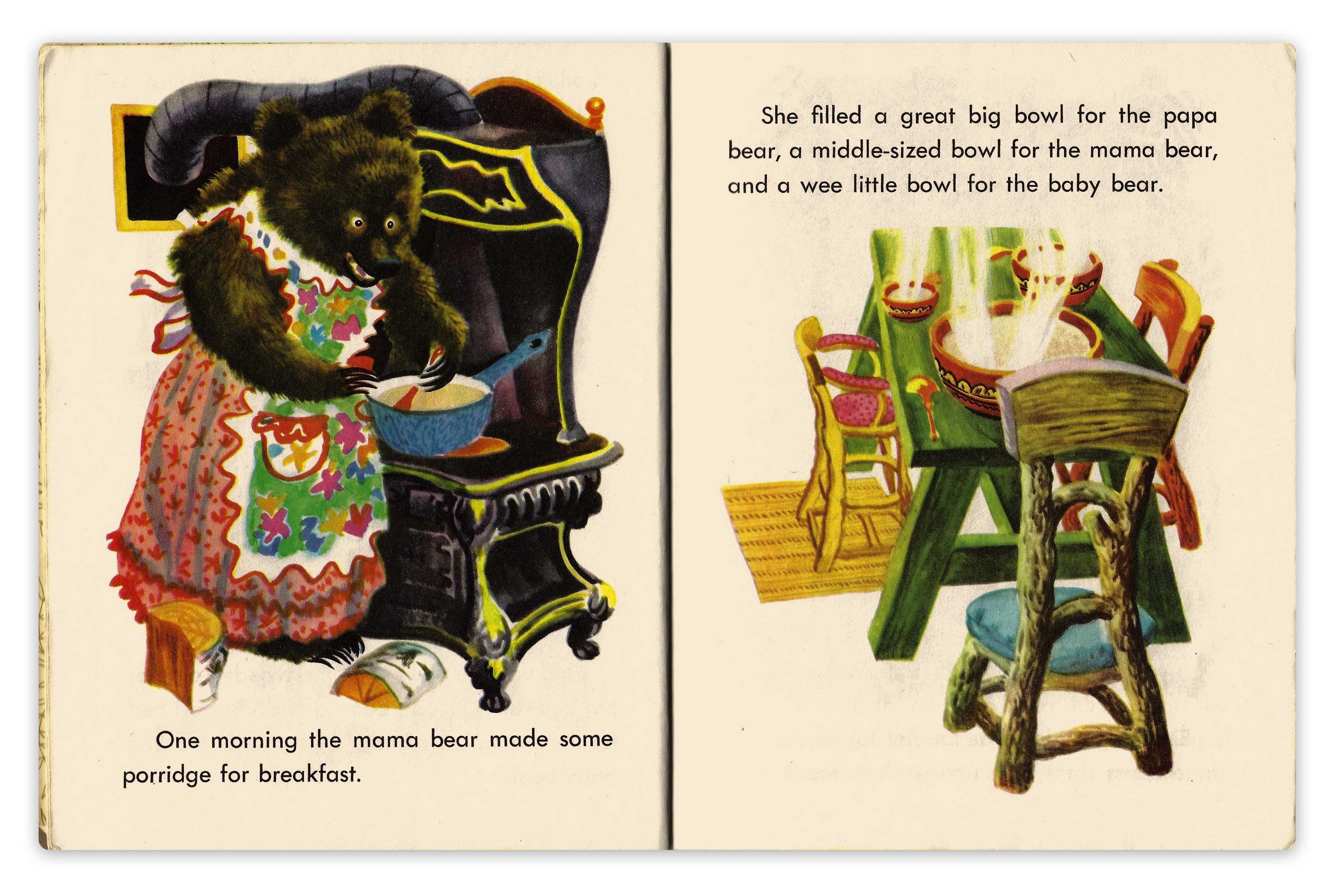
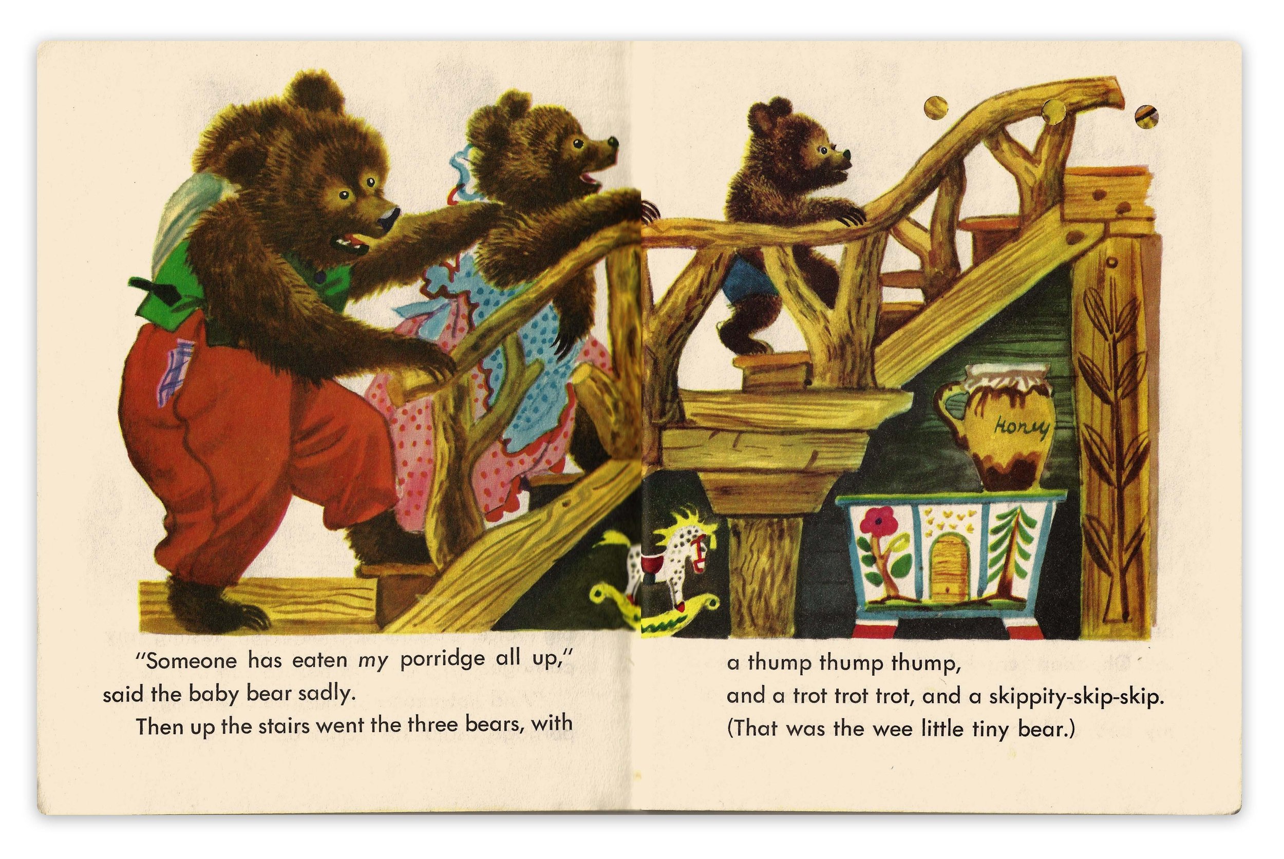
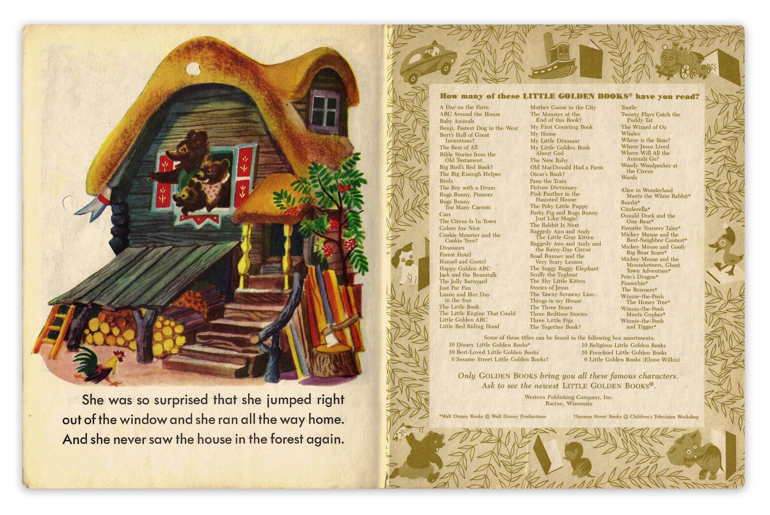
I think this version of Goldilocks and the Three Bears achieves this balance well. The information is clear because of simplification and interesting because of the detail and cartooned perspective. Feodor Rojankovsky’s observation and implementation of pattern is of particular note, it’s realistically convincing and graphically designed.
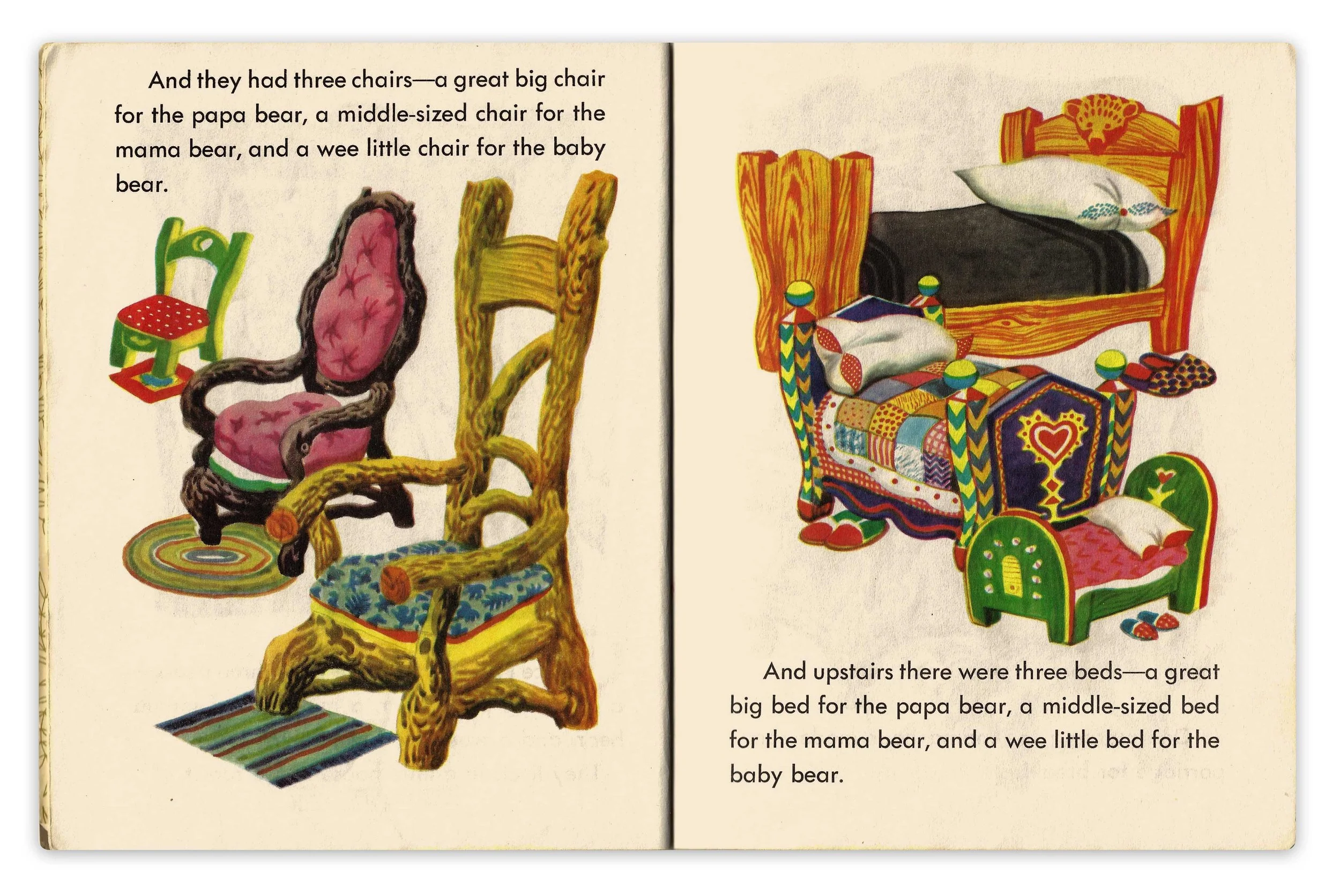
I’m a great big fan of drawing chairs and a not at all a fan of drawing beds. I know, splitting hairs here, but Rojankovsky makes both kinds of furniture sing, there is so much variation and personality on display here and the way he stacks them is graphic though with a perspective that’s just at least a little believable. The table scene below is another great example, hardly photo-realistic but still close to correct perspective. I doubt he ever made a horizon line and vanishing point, just eyeballing the thing works well enough and adds charm.
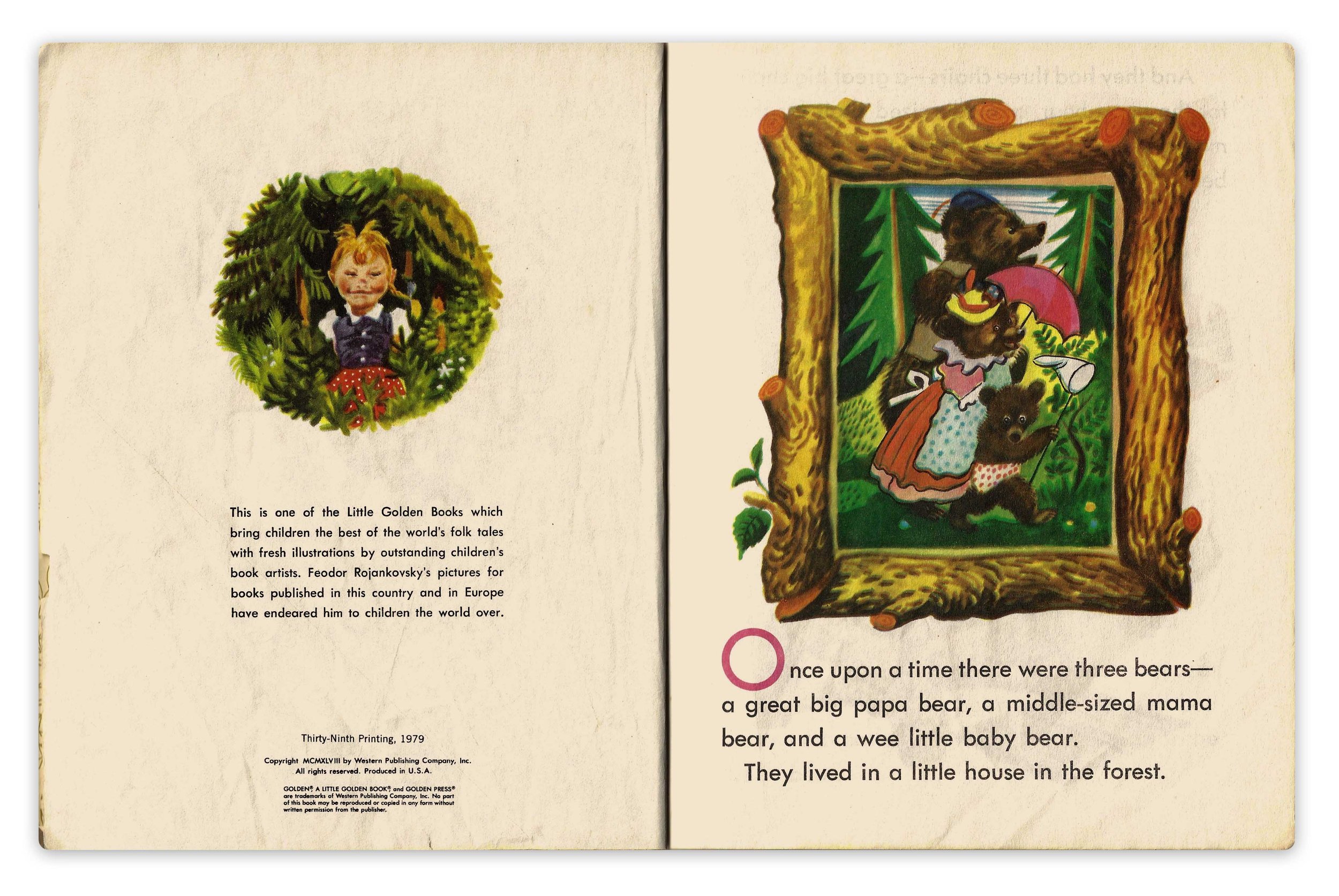
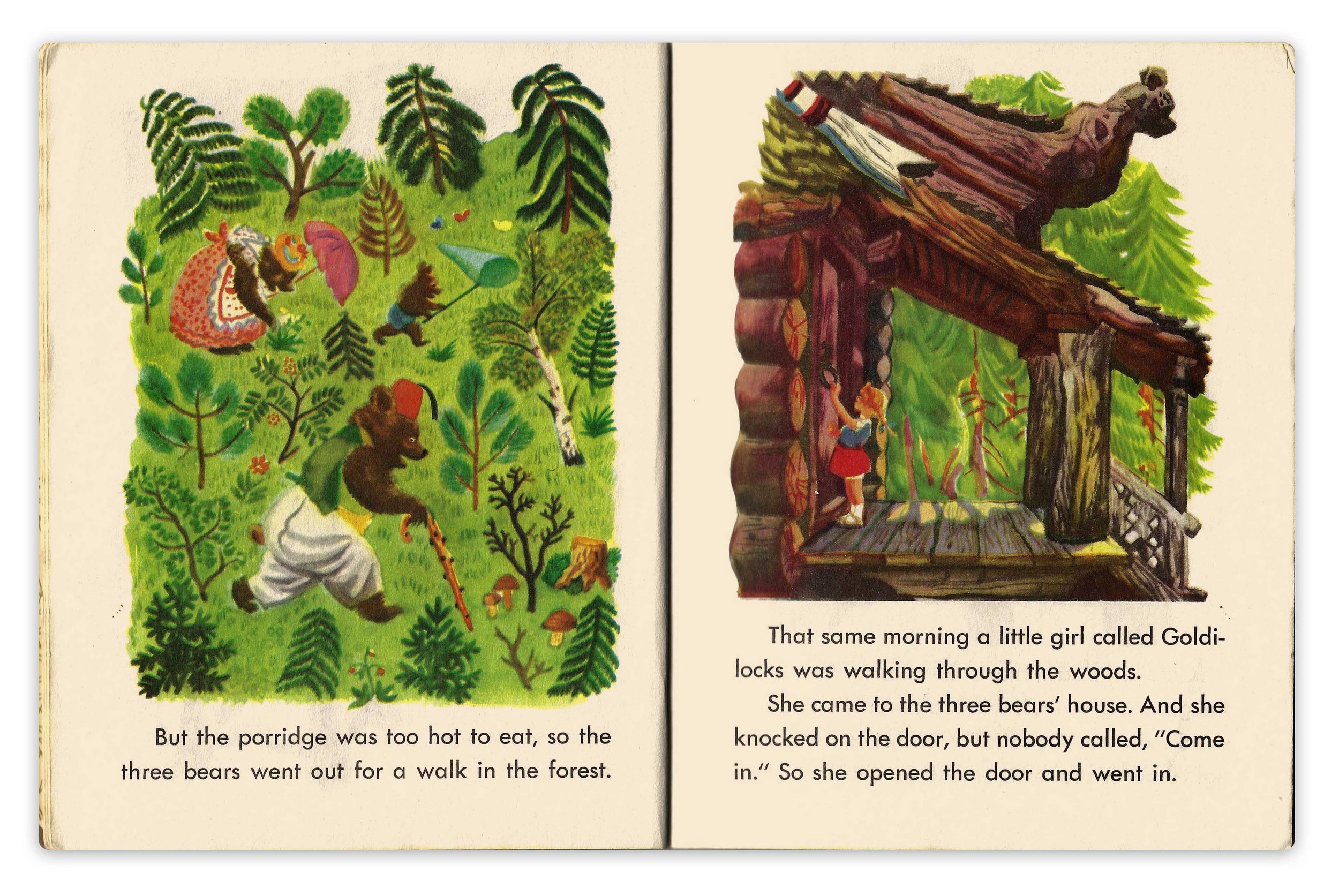
The left illustration above is remarkably flat but so fun because of the believable plant variety, everything there is iconic. And on the opposite side is the opposite kind of perspective, a very close representation of where Goldilocks is standing with accurate perspective in play. Fluctuation between the two extremes is another form of variety!
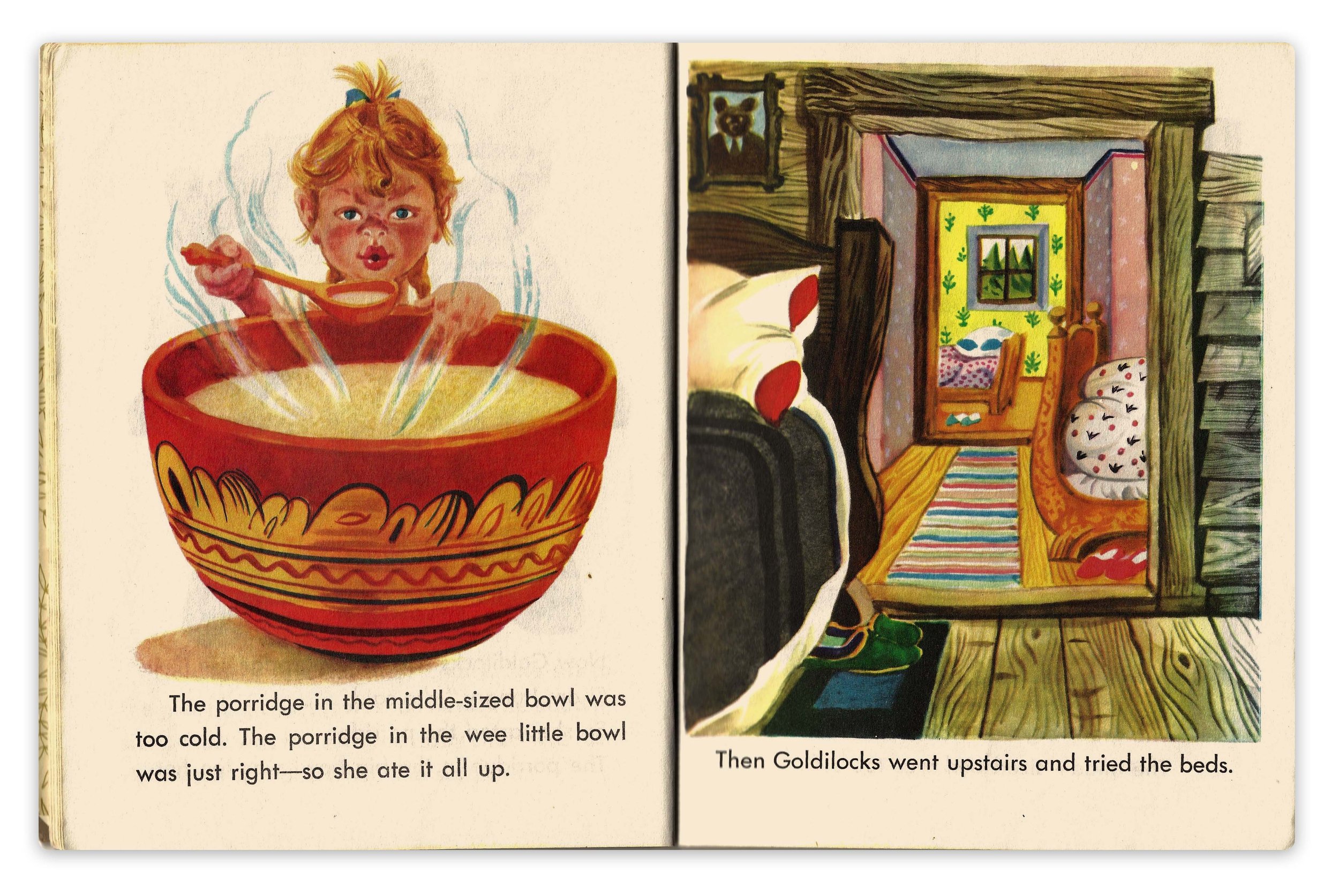
This hallway image on the right is masterful, we see three rooms in one illustration. The bed designs aren’t even consistent with the ones we saw earlier and it doesn’t matter because they are symbolic, iconic. The particulars of the designs and patterns aren’t important. He trusts the audience to understand what’s happening and he treats each image uniquely. For example, the poppa bear bed is dark brown because it’s in the foreground, elsewhere it will be a honey oak kind of color.
That picture on the wall! (crying emoji) Talk about foreshadowing! AND a great use of complementary shapes. Again, the bed design changes here to meet the needs of this illustration, not the previous ones.
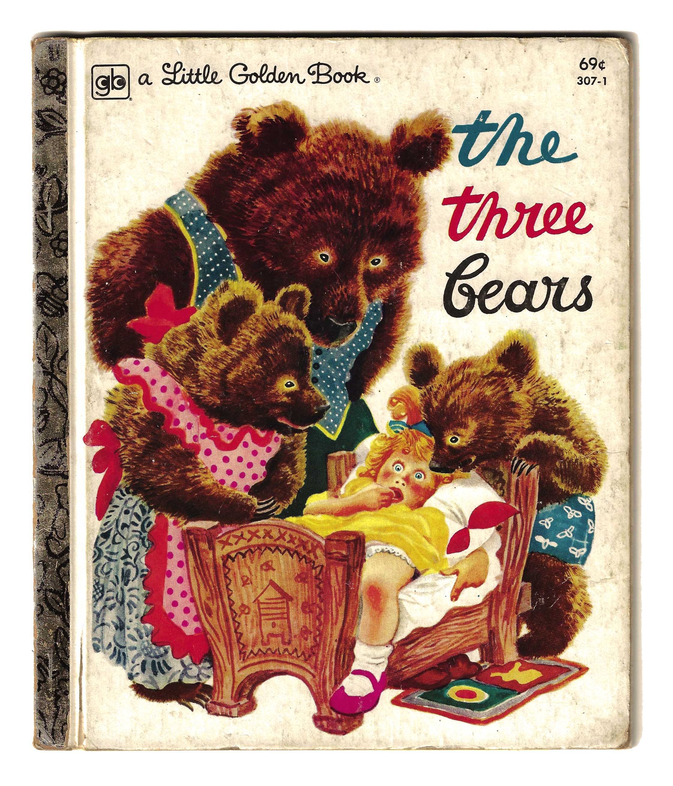
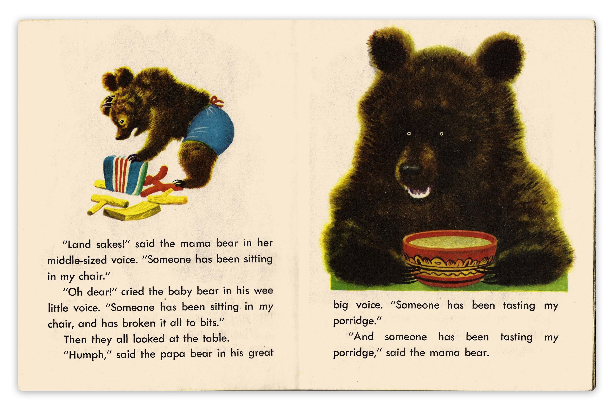
Could these bears be any creepier? Look at those blazed eyes in a field of black in the above right illustration. Terrifyingly fantastic! Little rings of death and desire. They are so oddly cartooned, anthropomorphized enough to be characters, yet still very much real bears.
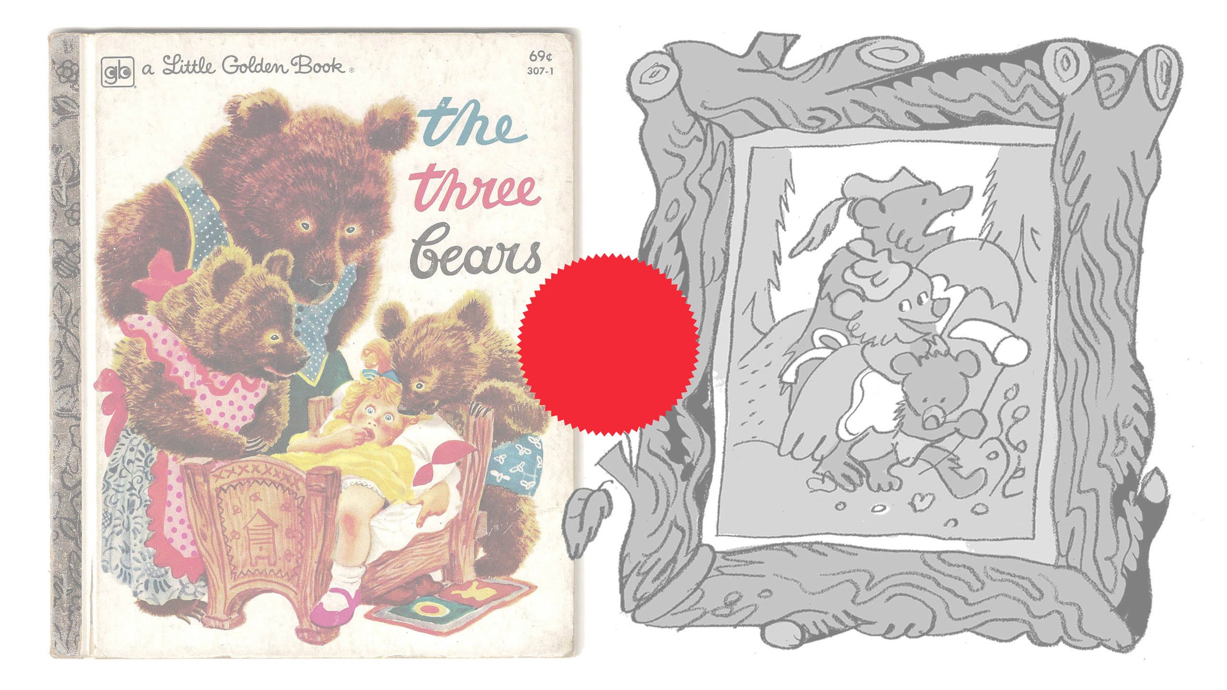
I don’t take many photographs or draw from life as often as I should, but I do use these vintage, printed materials in the same way. This is a safeguard from skimming off the top of the current visual culture and establishes roots based on the traditions of printed books. Below are a few examples of how I interact with these books and translate them into a usable language for myself.
Also, I’m back on Youtube! Watch me flip through this book and talk about it more fully there as well as draw these sketches. I’ve missed it more than I thought I would and am excited to come at it more regularly, hopefully once a week! Subscribe, like, and share if you dig it. Thanks!
