Sam Hiti is Kickliy and Kickliy is the one to beat. A master of many crafts shows us what he’s made of in this new, self-published comic series. For a closer look and review watch my Youtube channel HERE.
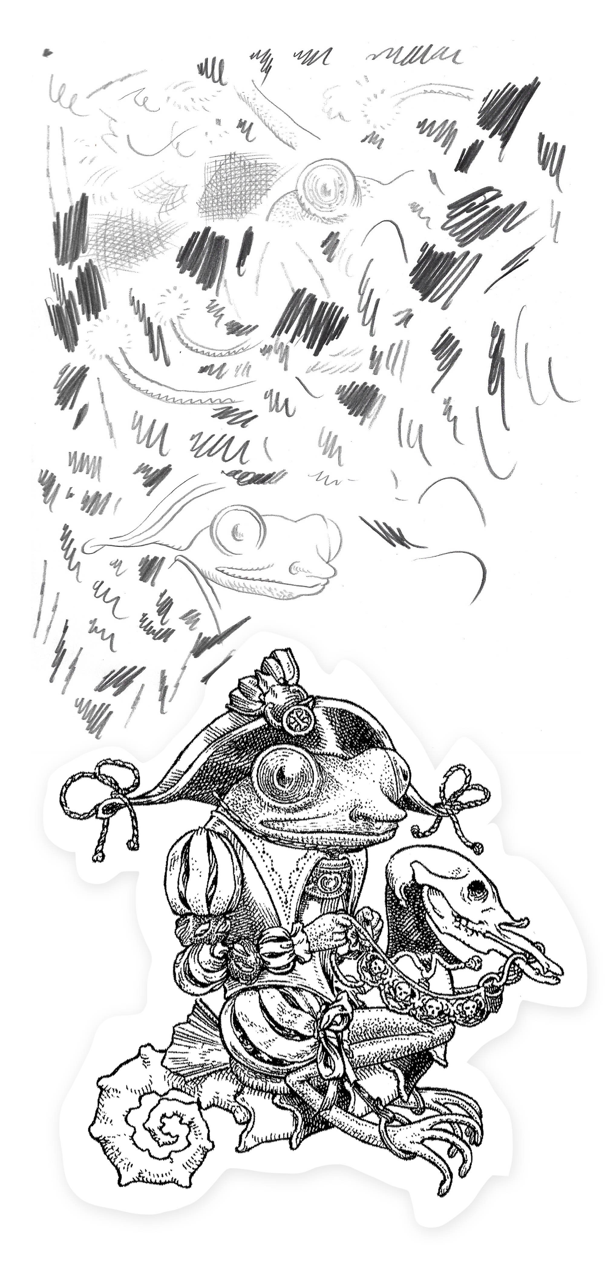
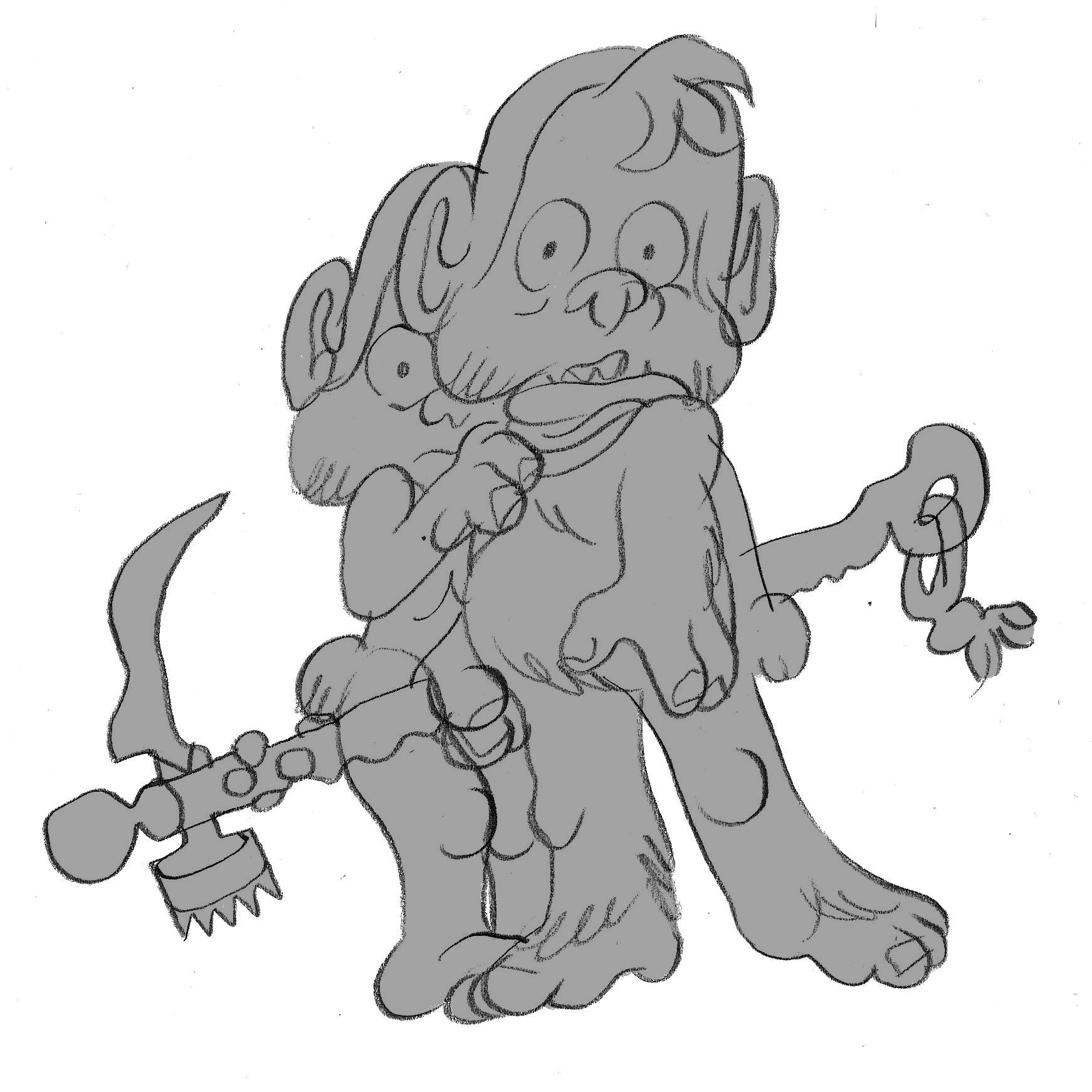
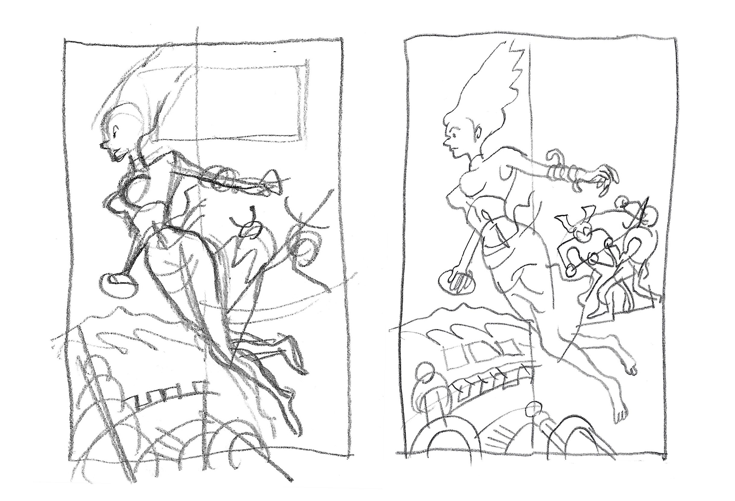
It’s the end of days and righteous demon hunter Mario Román lights up the dark allies of San Pablo with the sword of the Lord. A biblical action adventure to thrill the kid in all of us, this series is packed with good characters and a growing evil. Kickliy executes both story and art with excellence. But brushwork reminiscent of Hugo Pratt, character designs to make even Alex Toth proud, and a daring story have always been a feature of Kickliy’s work. This is a creator who not only has high standards but the work to meet it.
Copies of Tiempos Finales can be purchased on Kickliy’s webstore HERE. The $20 per issue could stop some customers in their tracks, but I’m much happier to pay more for the few quality comics being made today. This one feels exciting and new and the direct link between artist and customer is more or less an honest one, a contribution toward the stories and quality you want in the world. Take my money and Godspeed on the next issue.


Again, for a closer look and review of Tiempos Finales watch my Youtube channel HERE.